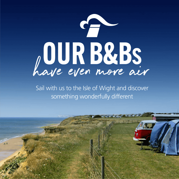
Refreshing a ferry icon to capture hearts and holidaymakers alike


Strategic & Creative Lead Agency
Brand Positioning
Branding Development
Brand Strategy
Integrated Campaigns
TV & VoD
Social & Digital Comms
Content Creation
Outdoor & Print
Overview:
Red Funnel have been operating services to the Isle of Wight for the best part of 2 centuries. The original, authentic operator, they are a characterful company, staffed by generations of islanders and with an amazing heritage.
The challenge – how do we encapsulate all of this into a new positioning which also works with the character of the destination?

Our Solution
We talked to people throughout the business and found a unique spirit, and also a real consensus on what makes the company special – its people and the service they deliver, its sense of fun and its long-standing connection to the island.
Together, Red Funnel and the Isle of Wight are 'Wonderfully Different'.
The results


Being More Red
In our appearance
This is about making our mark as the obvious choice for the IOW, but also holidays in general. Red gives us a clear brand signpost in the consumer memory.
In our brand vision
This is about thinking big and bold too – if something isn’t wonderfully different, we don’t talk about it. The journey to and from the island starts with creating excitement, and bringing it to life with originality and flair
In our mindset
Red is for attention, so we need a confident mindset to match. The colour Red stimulates excitement and energy, which is our invitation to push the brand.


